Client
Swapfiets
What we did
Consistent, scalable content for international growth
Swapfiets is an international brand with an always-on e-commerce model. This requires content that remains consistent across product pages and markets, while staying flexible enough to support new variants and future expansion. Peek supports Swapfiets as a content partnerby bringing structure, consistency and scalability to the way content is created and distributed.
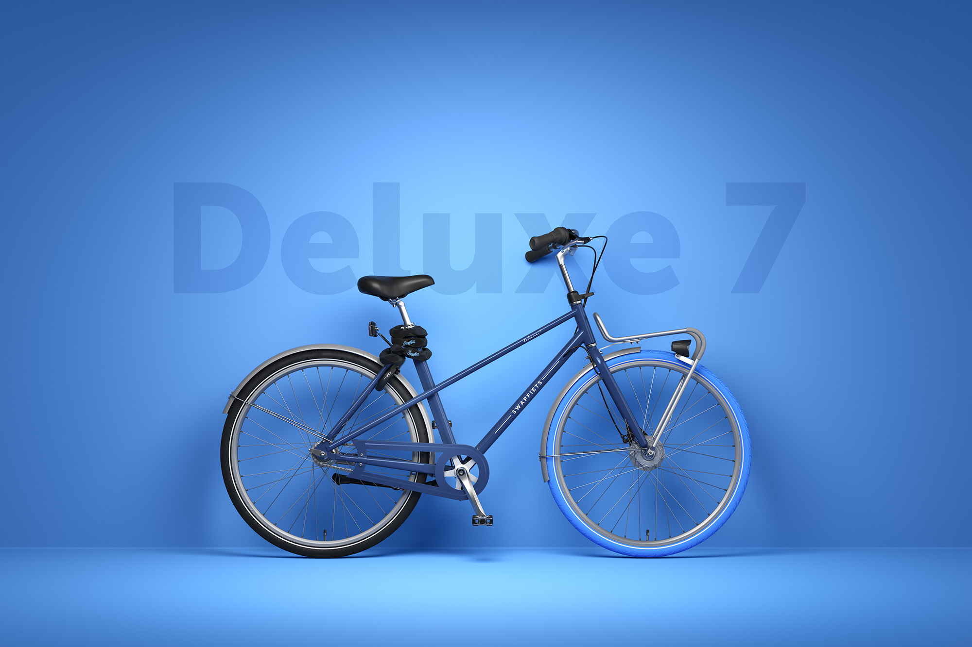
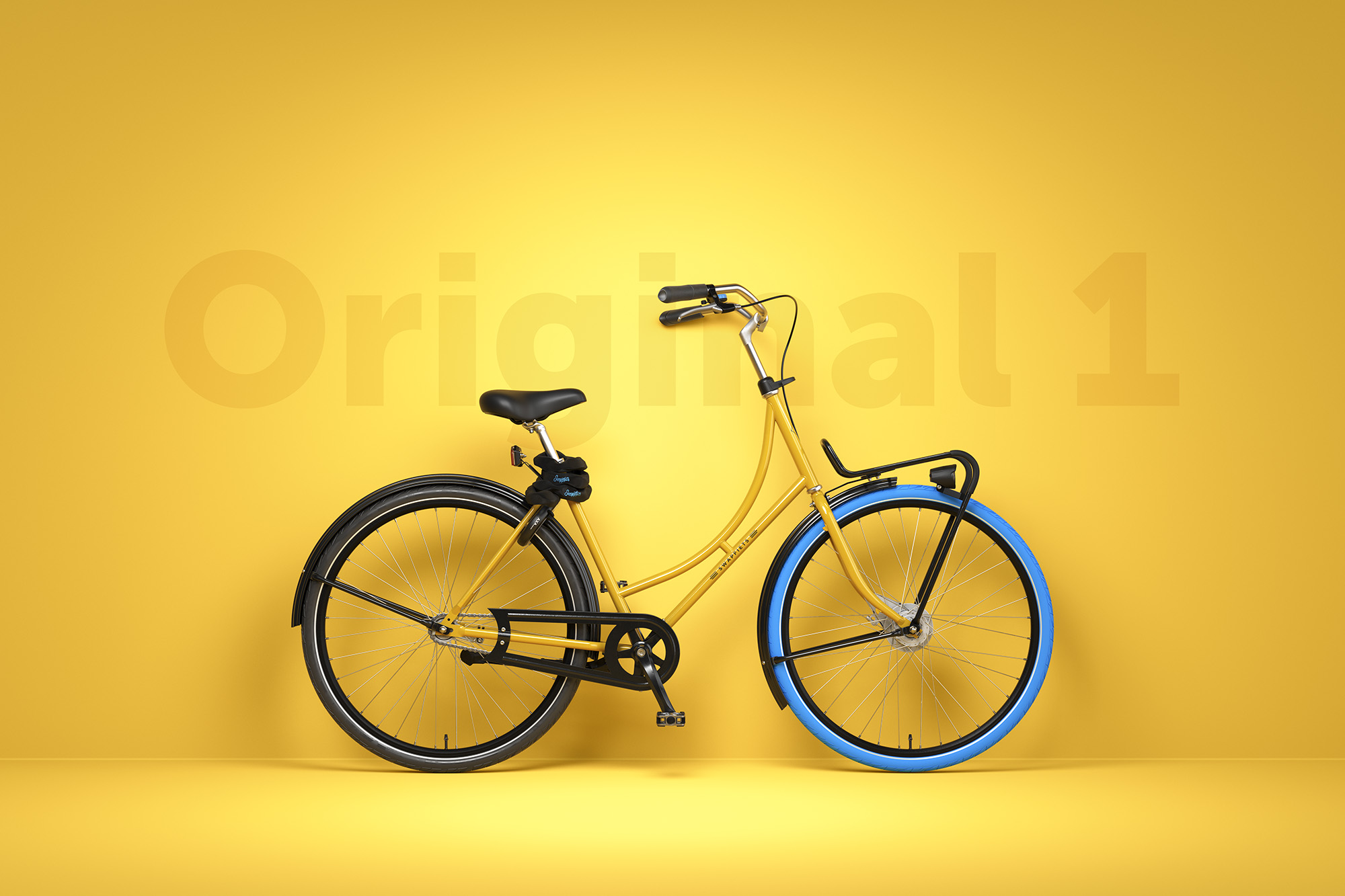
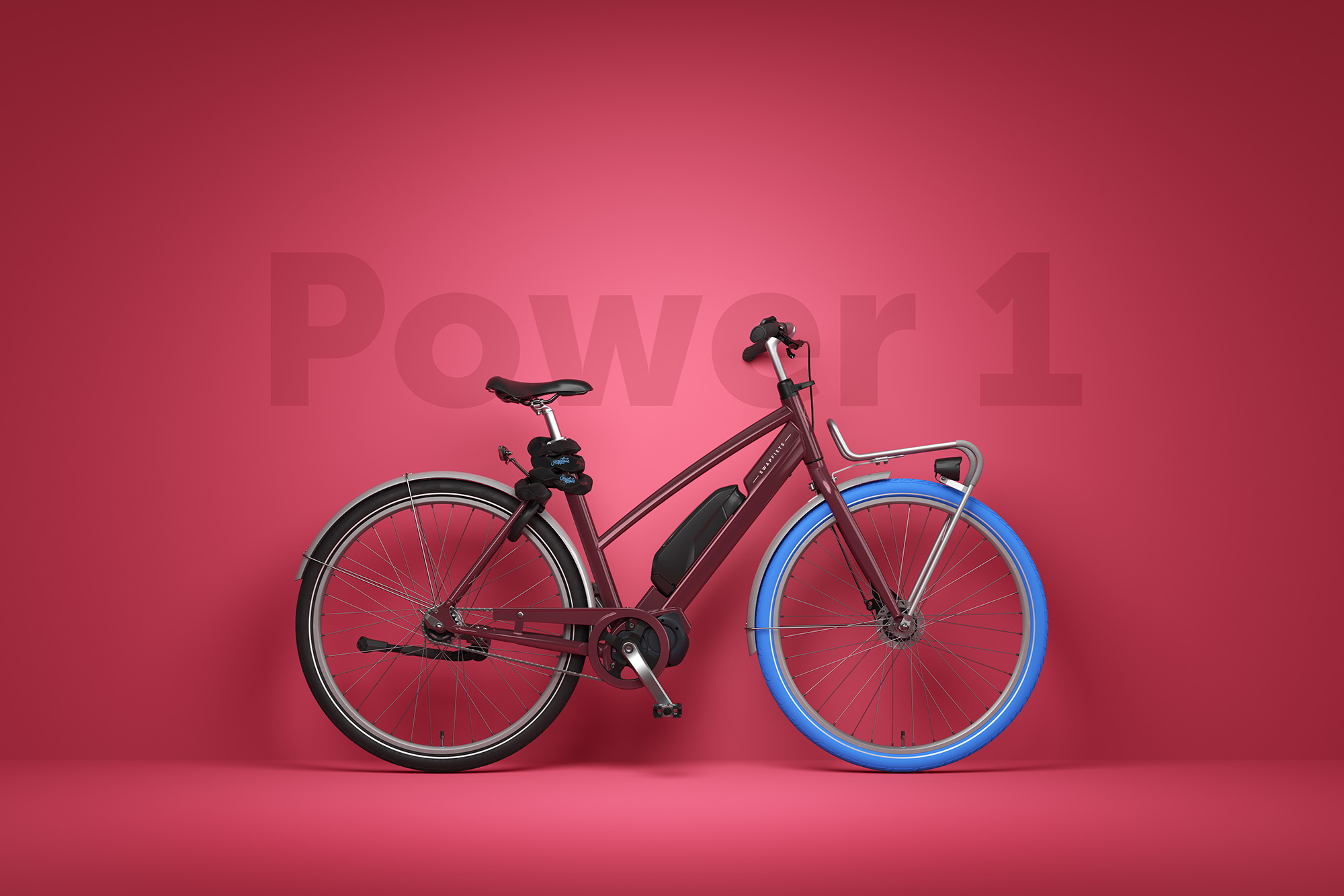
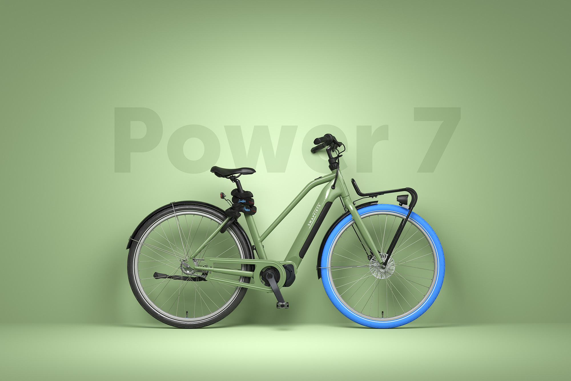
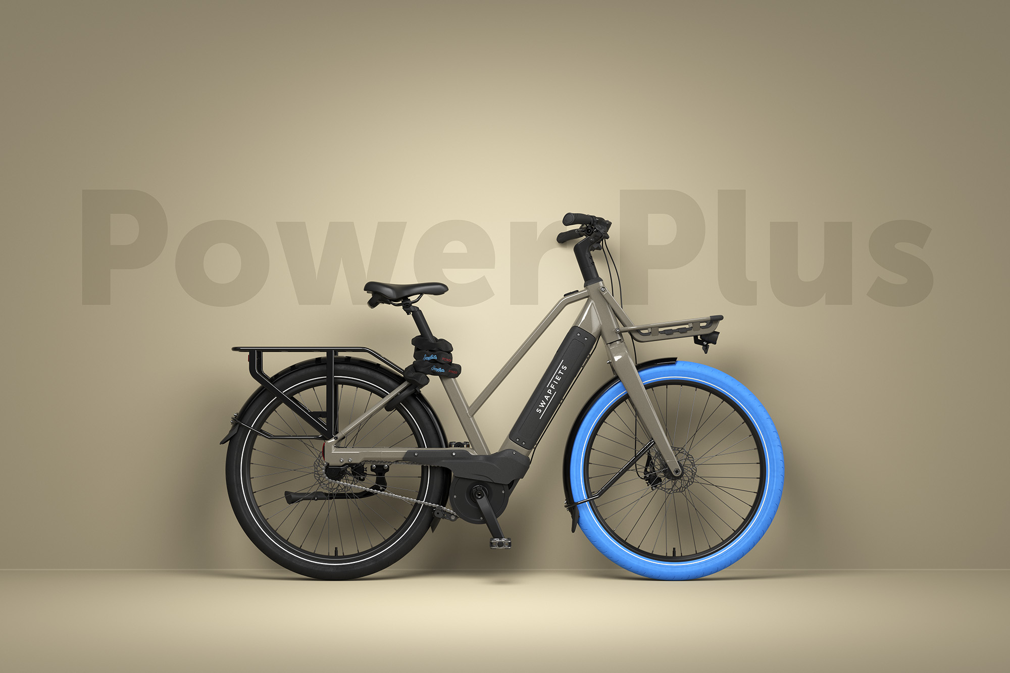
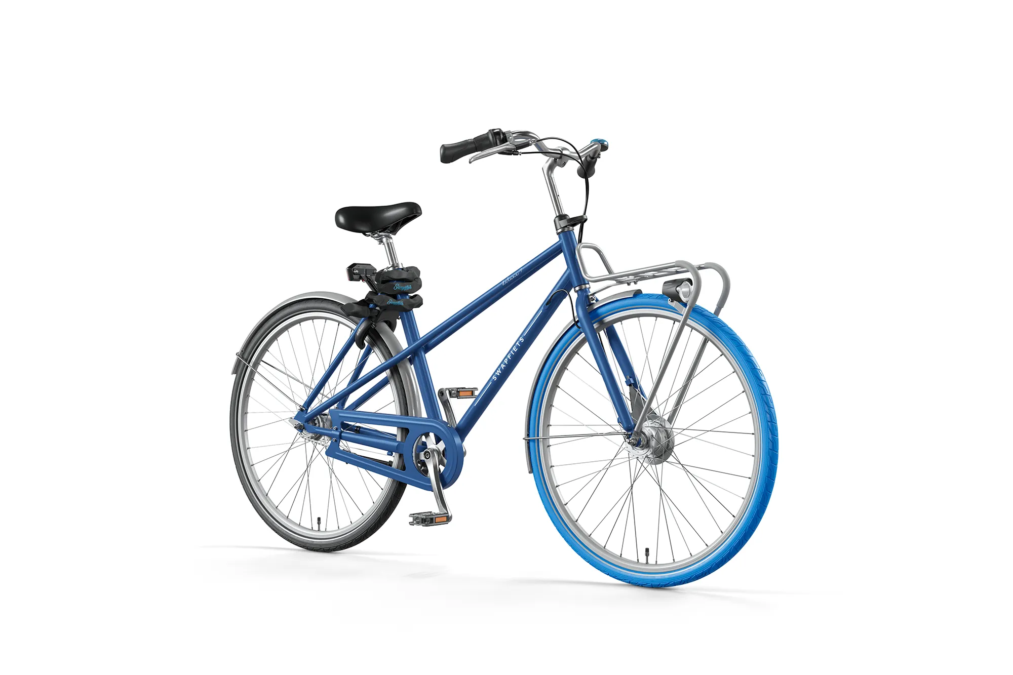
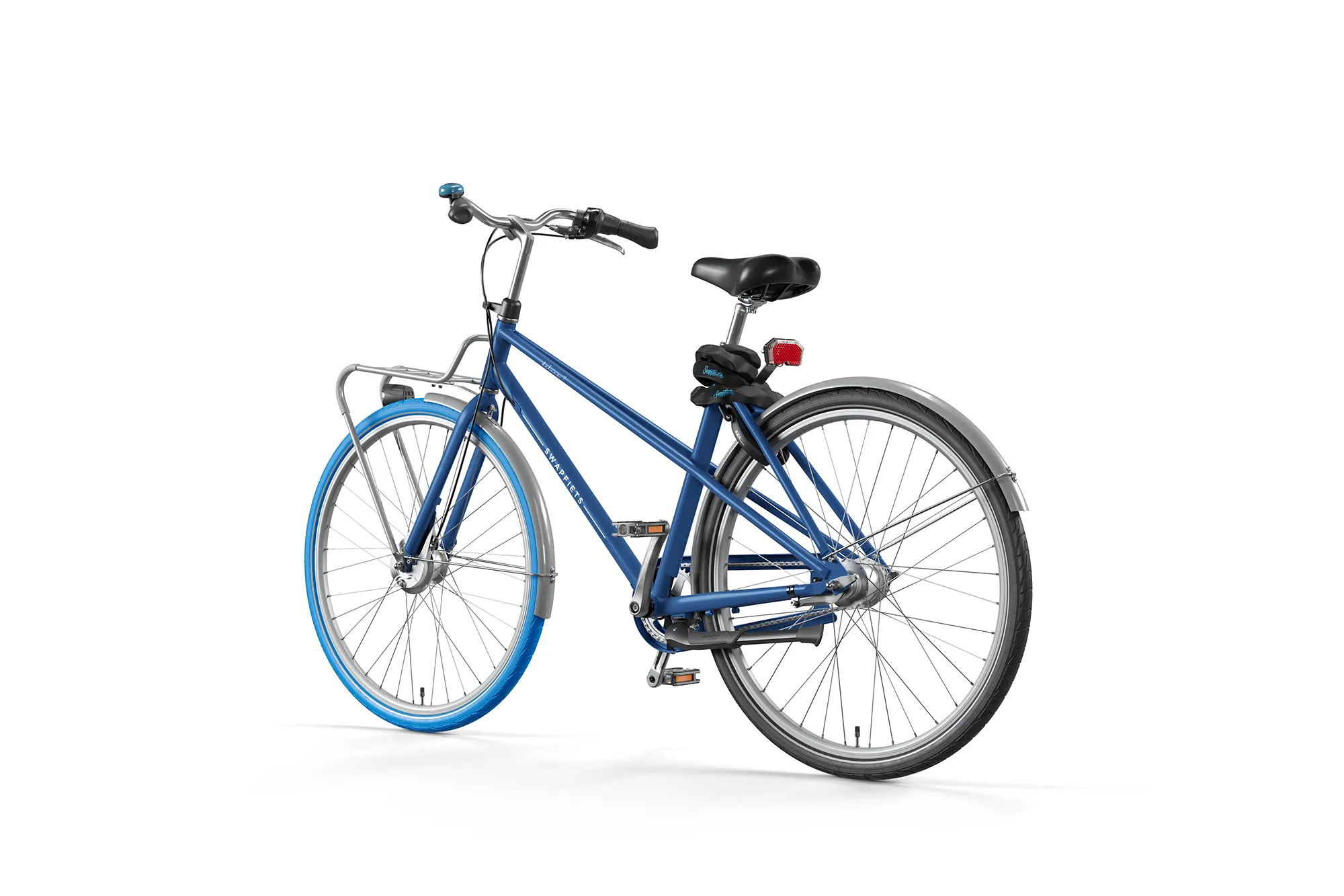
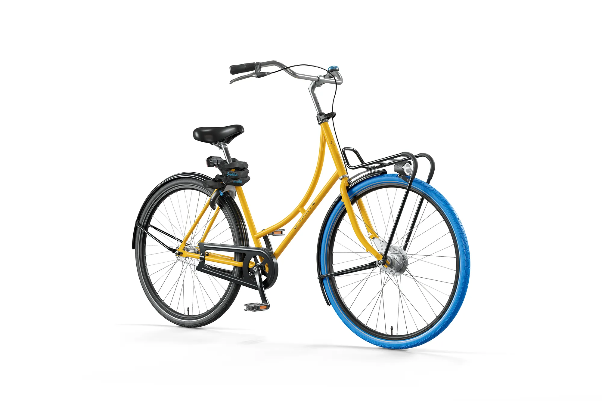
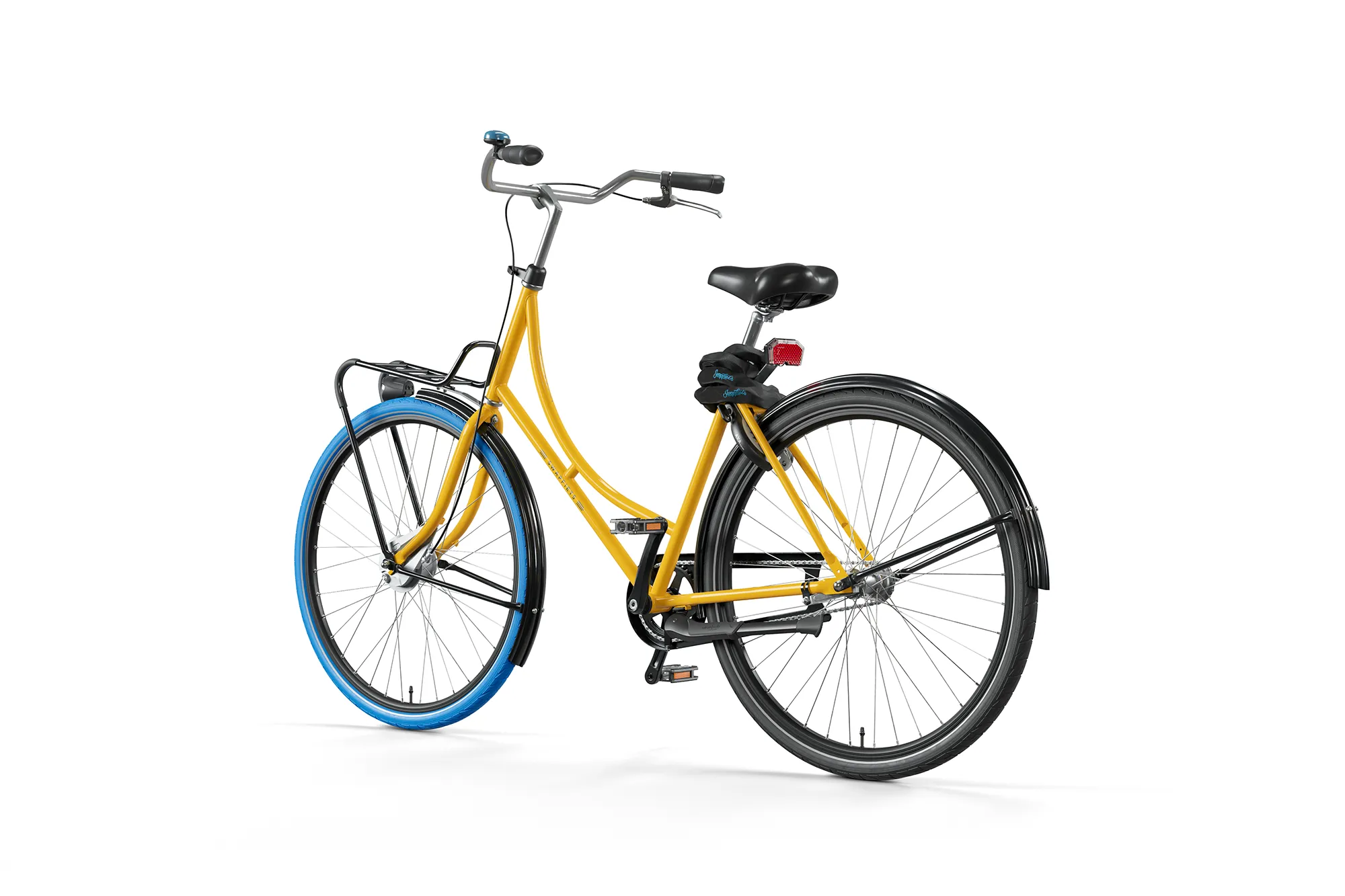
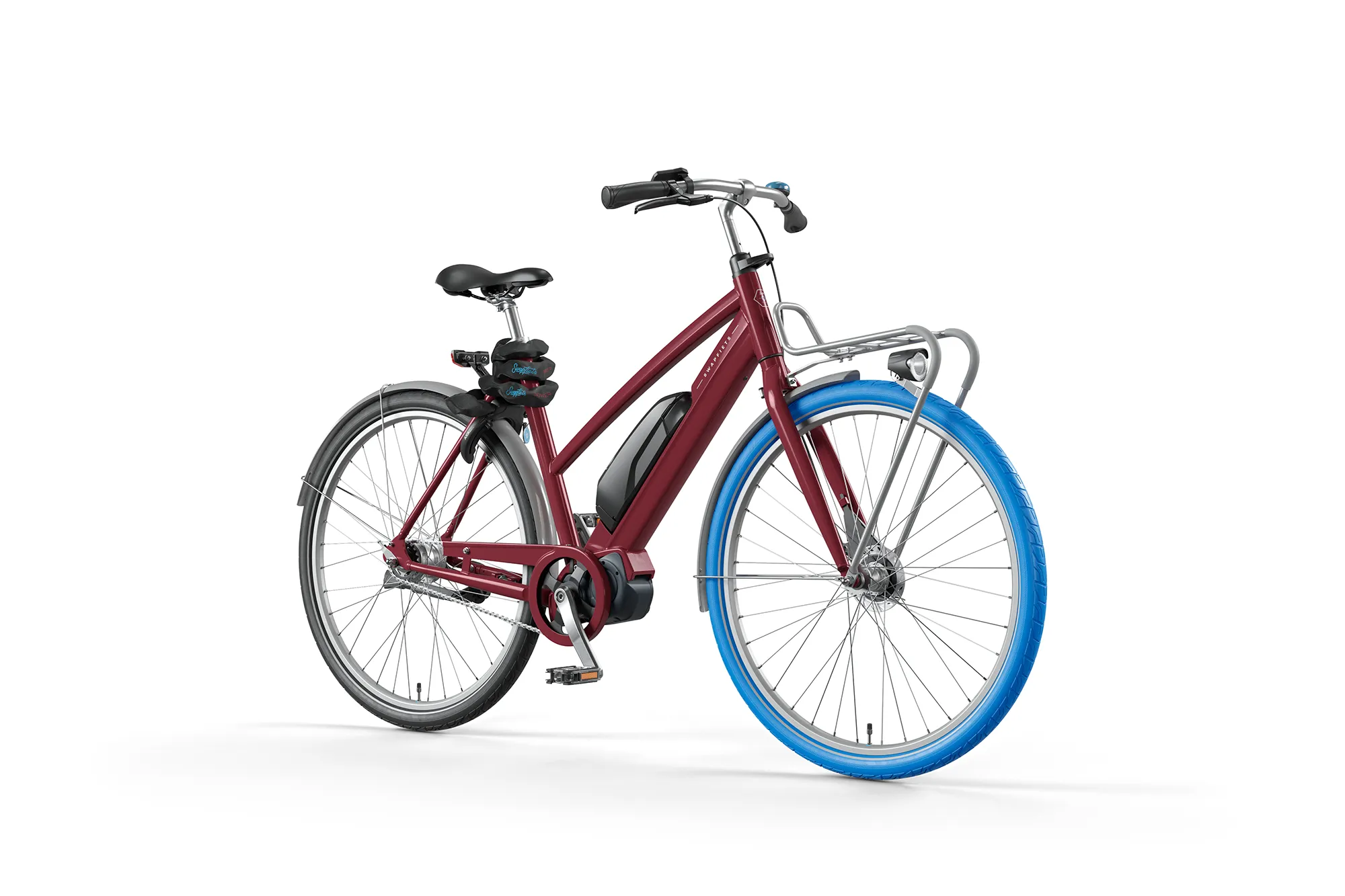
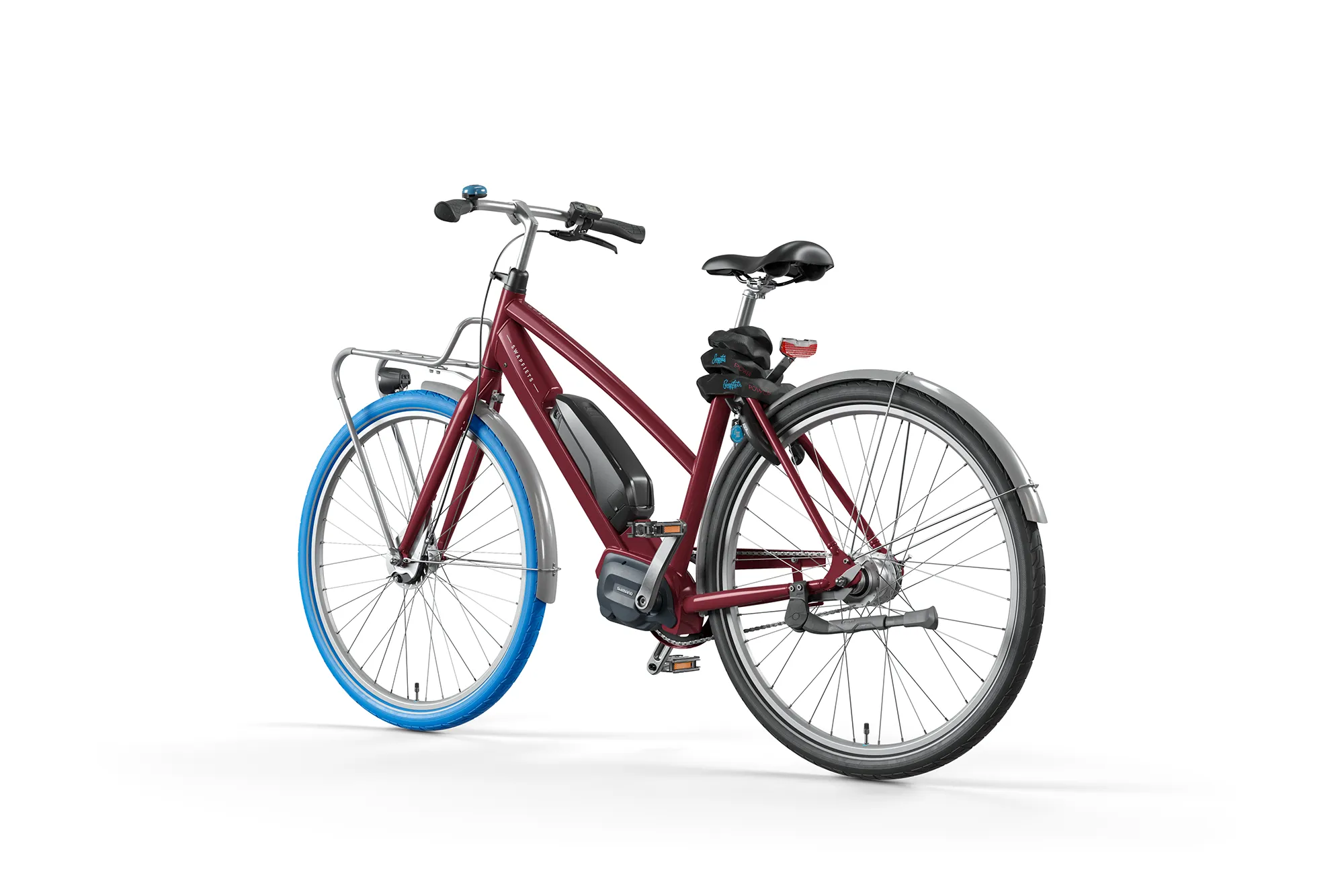
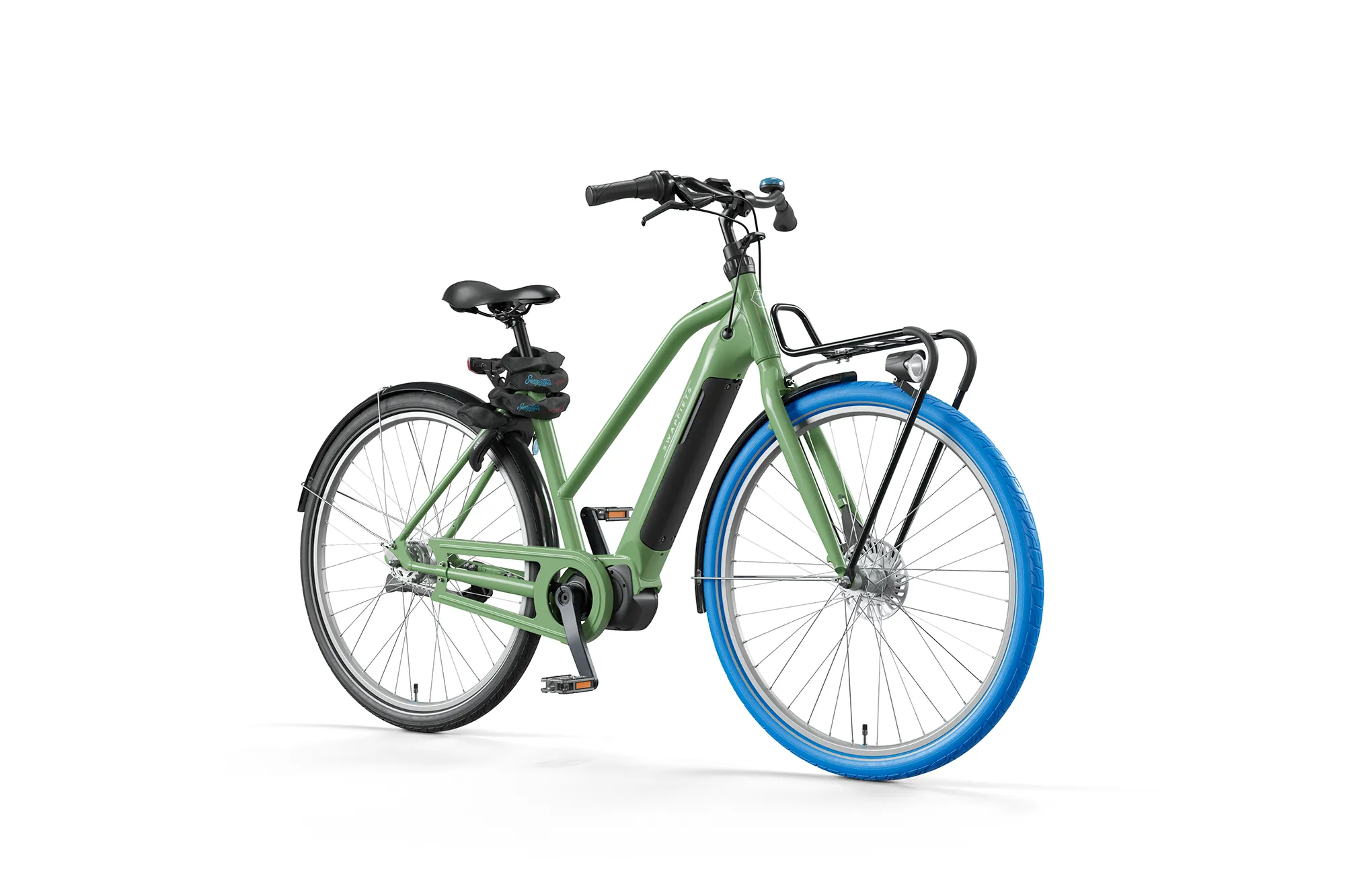
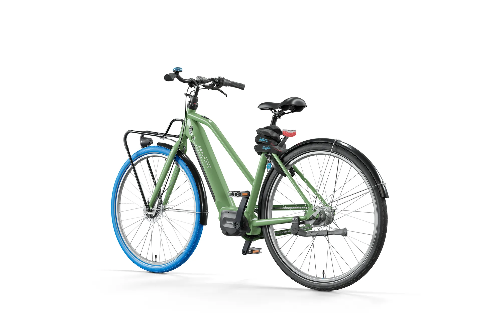
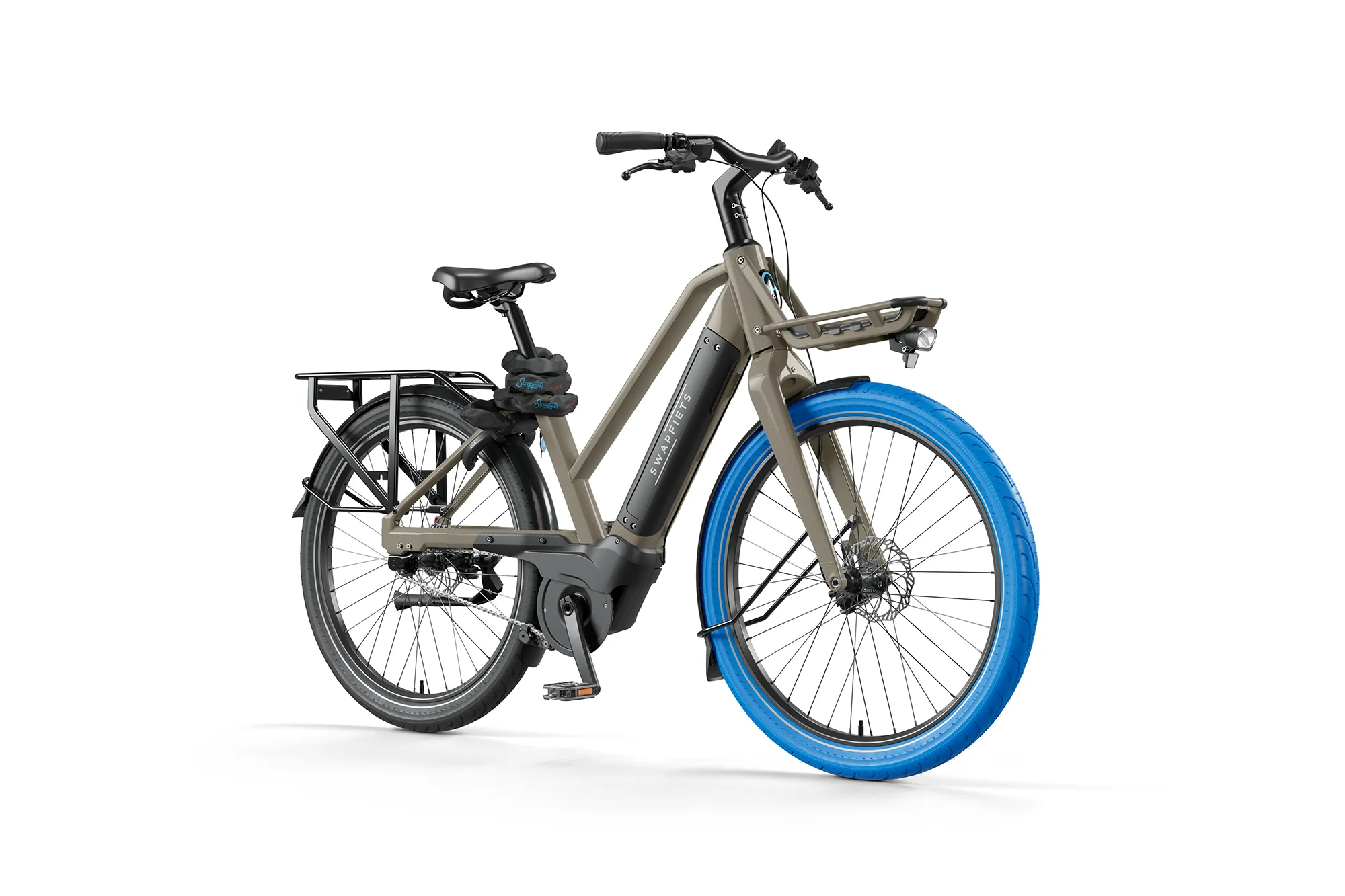
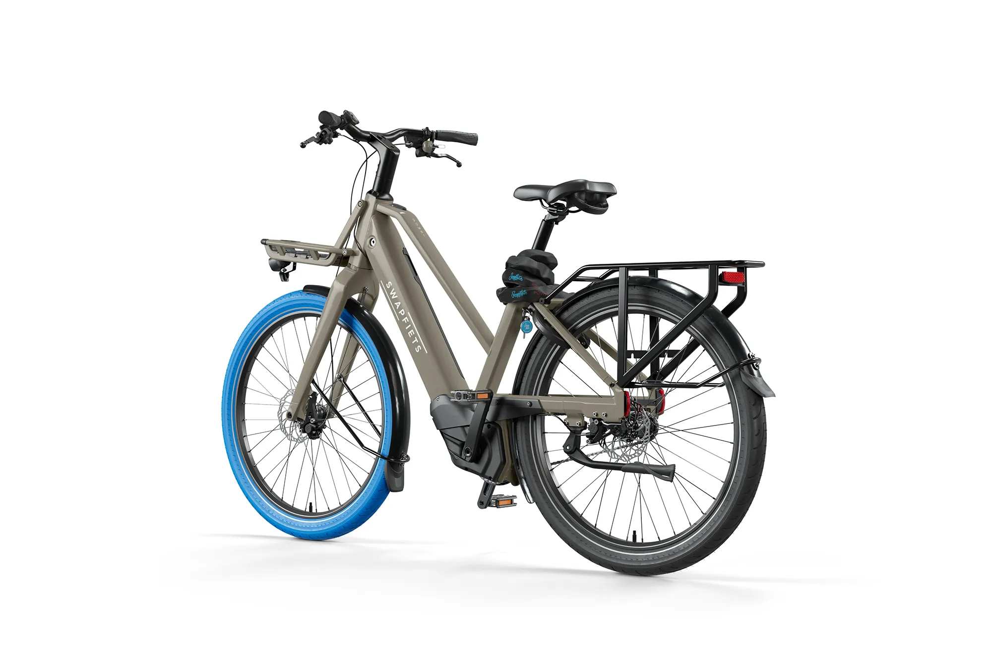
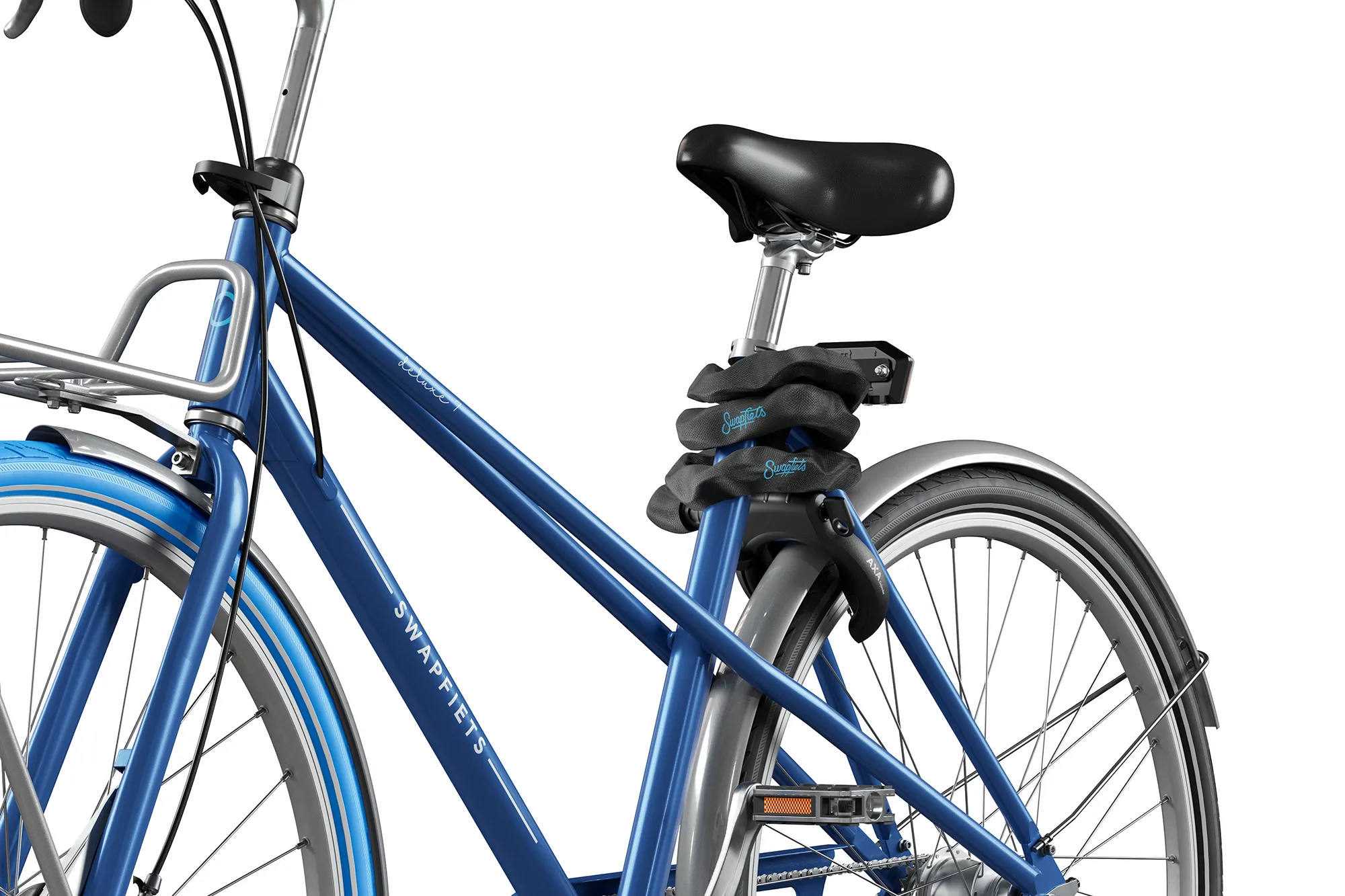
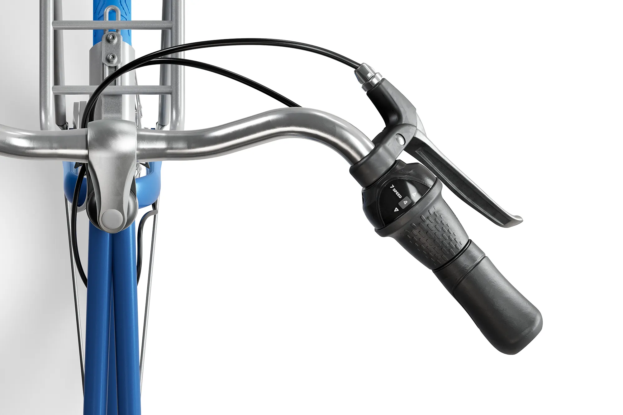
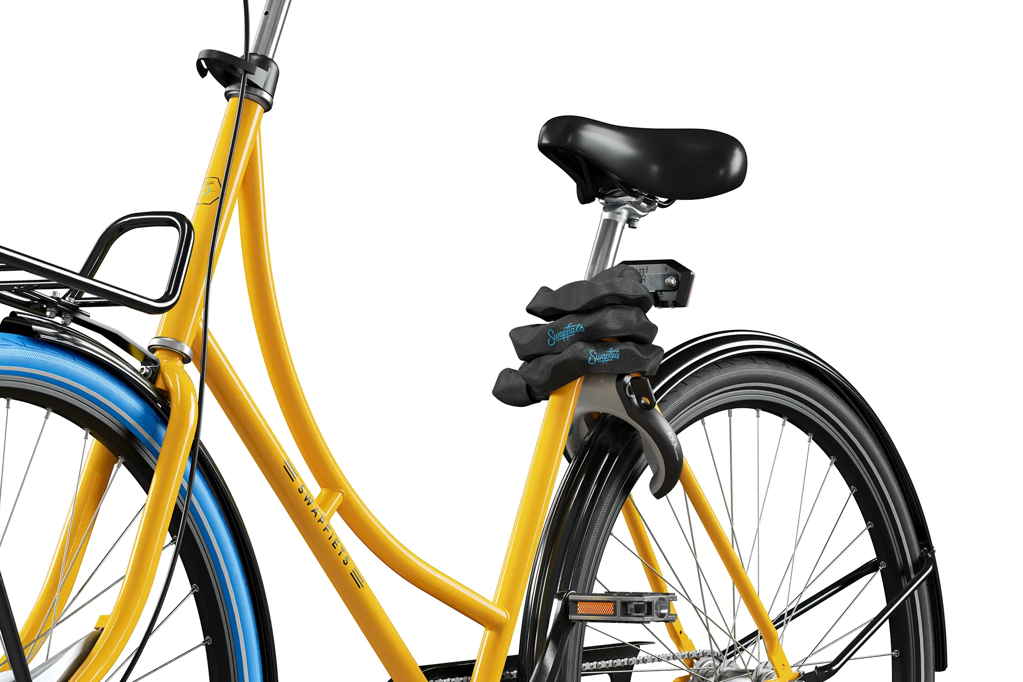
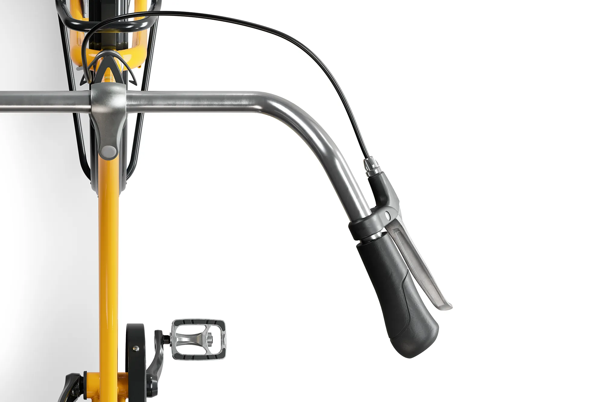
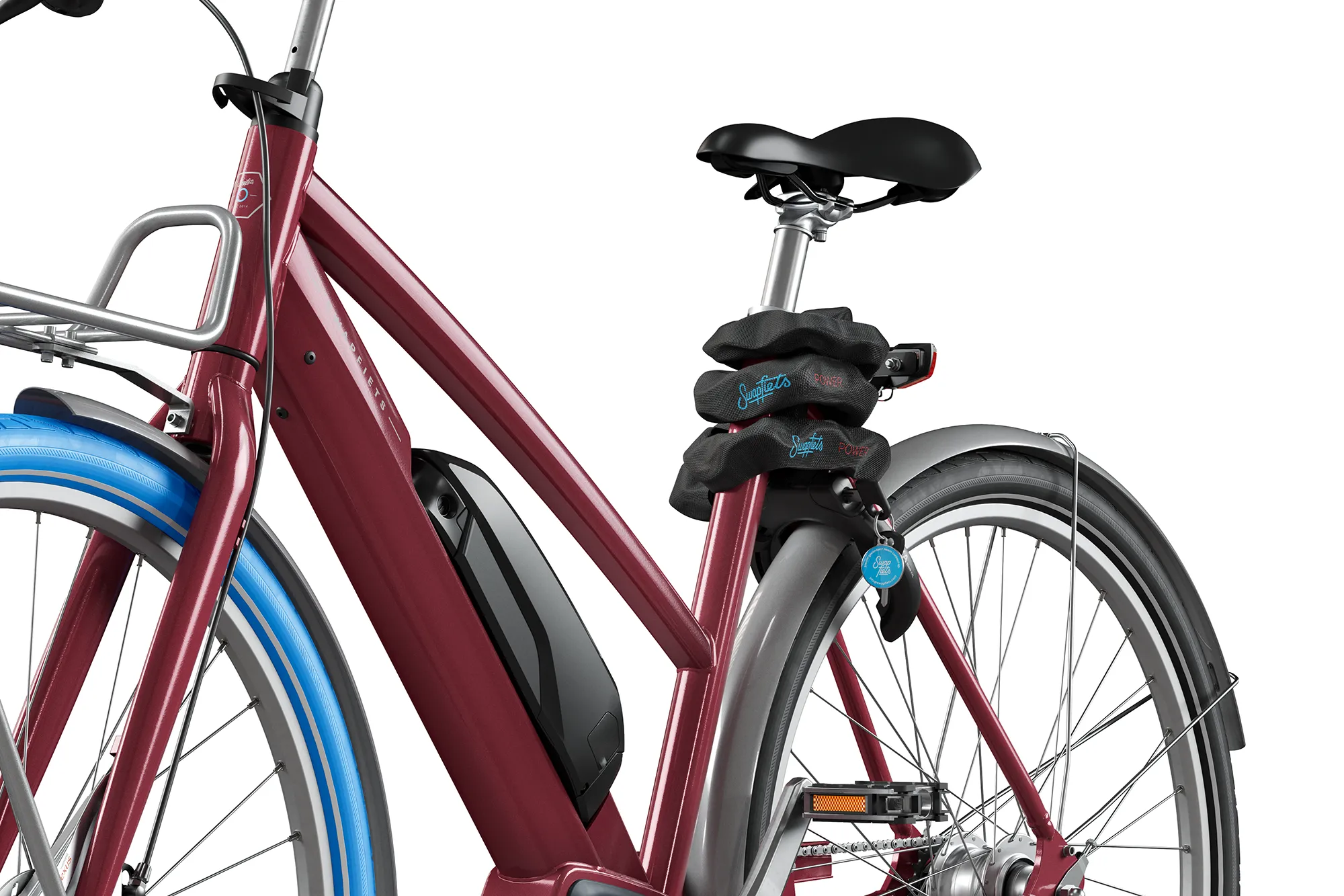
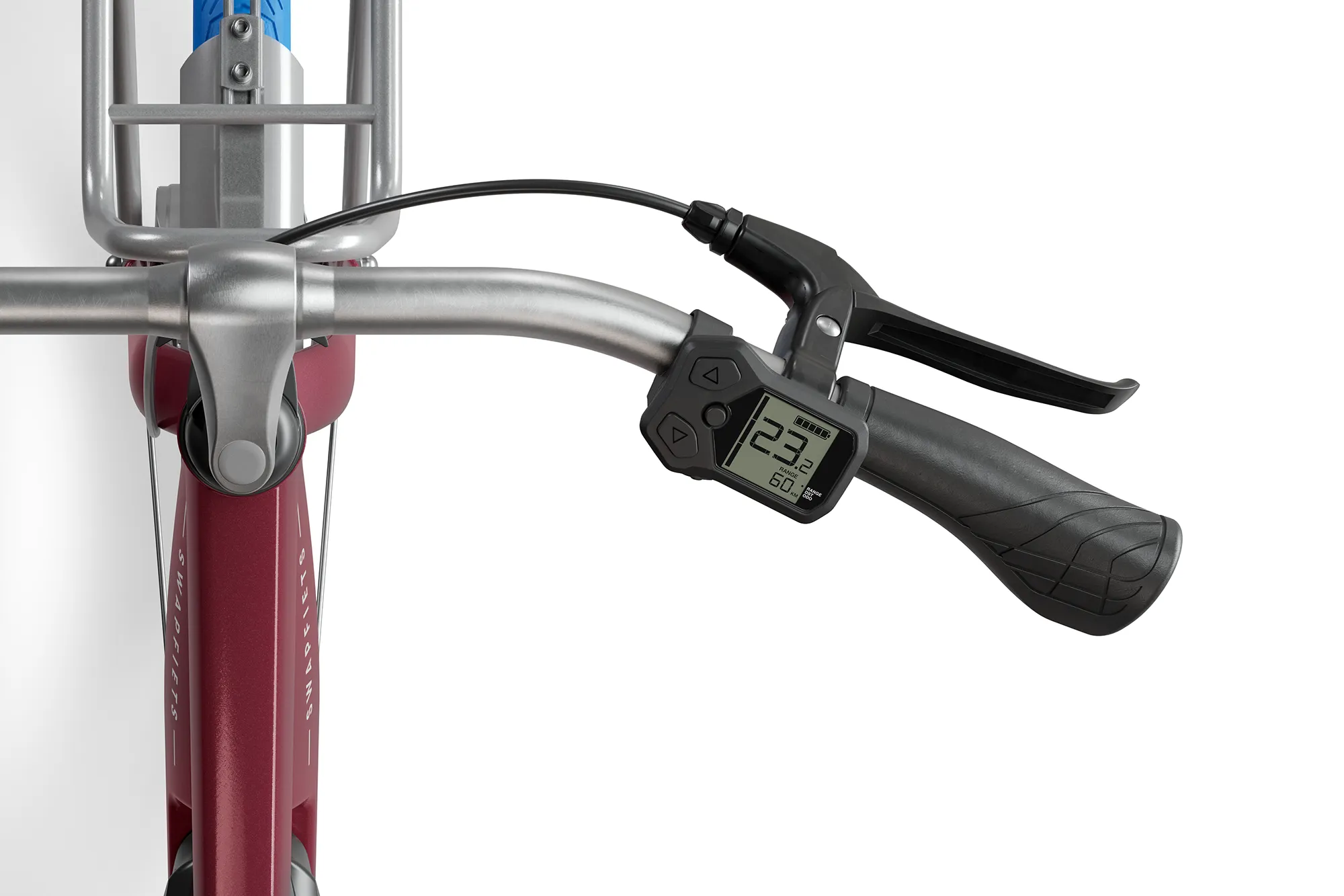
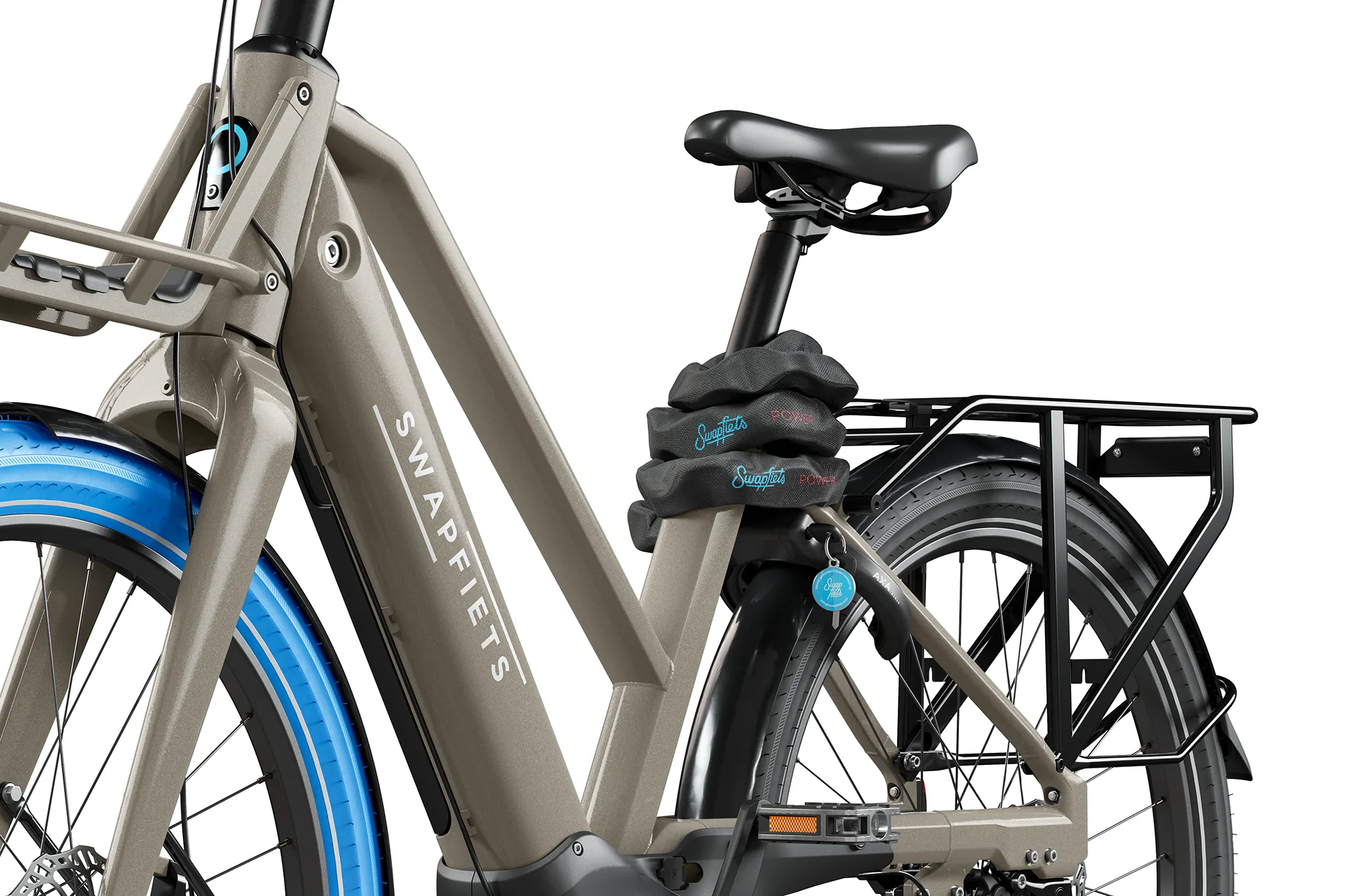
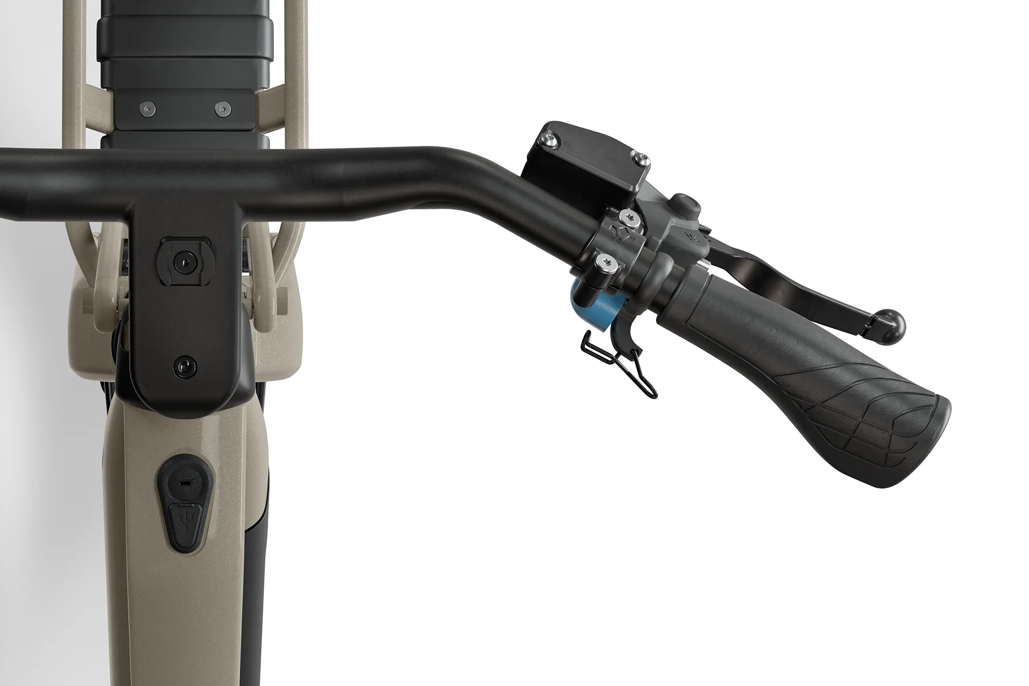
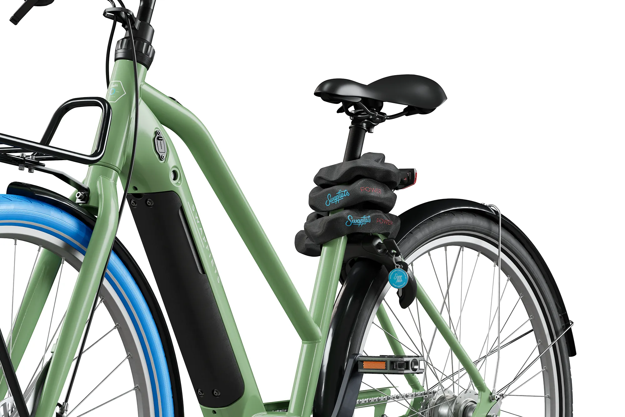
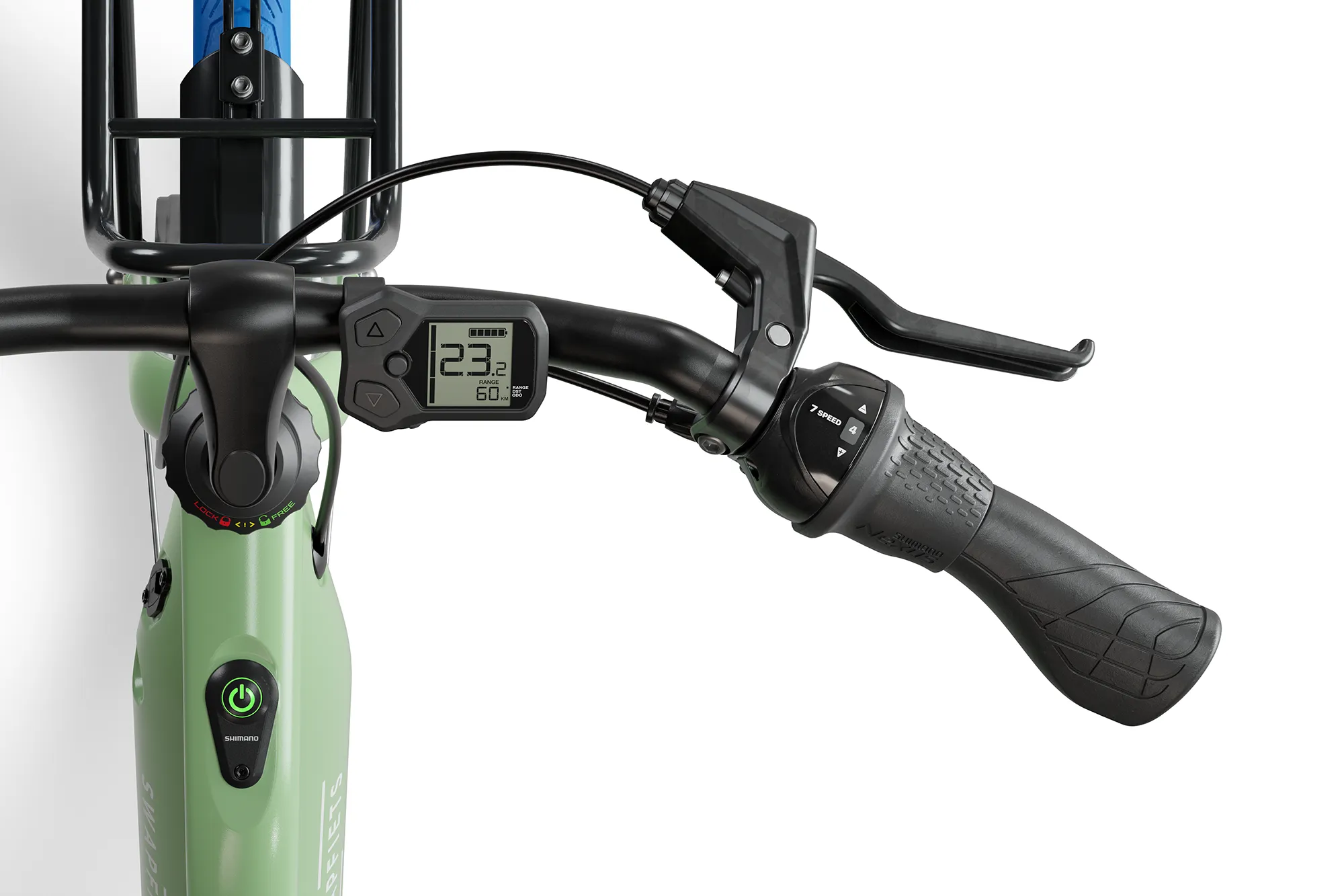
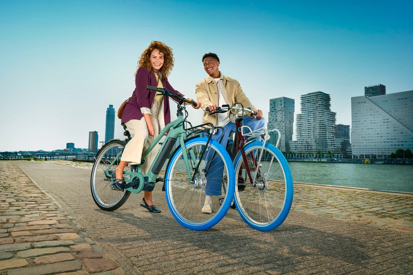
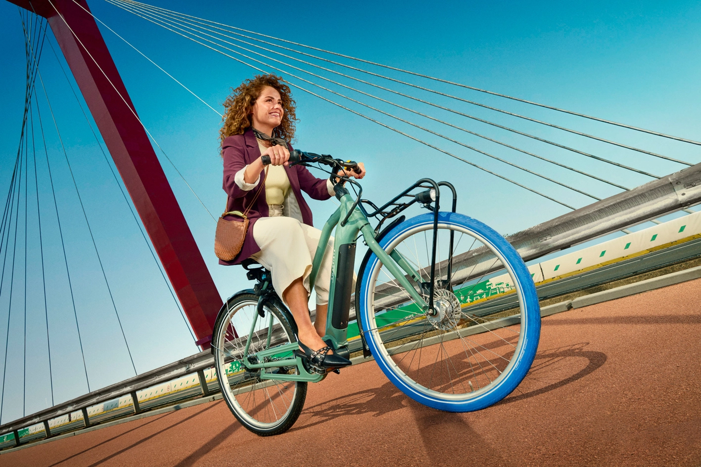
Together with Swapfiets, we adopted an automotive-inspired approach: one strong, distinctive color per category that immediately resonates and creates visual clarity across PDPs. Although the bikes are available in multiple colors, this approach clearly defines categories and makes it easy to add new variants without compromising consistency or brand recognition. Background colors were carefully chosen to highlight Swapfiets’ distinctive blue tyre, reinforcing brand recognition at a glance.
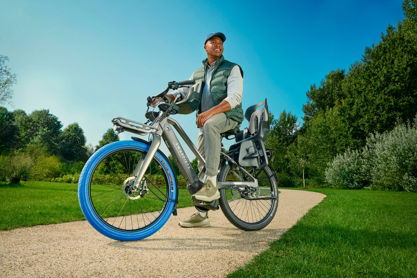
By combining high-quality product renders with lifestyle photography, we created a consistent tone of voice across all touchpoints. Product renders provide control and scalability, while lifestyle imagery adds context and emotion. The result is a unified brand experience that supports higher conversion and ensures the brand is perceived consistently, from e-commerce to campaigns and social.
Results
- Internationally scalable content, easy to roll out across markets
- Consistent PDPs across all product variants
- A future-proof content structure that’s easy to expand
- Increased conversion through clear, recognizable product presentation
- One consistent brand experience across all touchpoints